北極品牌設計顧問


品牌策略
包裝設計
中秋禮盒設計
品牌視覺
蘭亭茶莊為桃園在地知名茶葉品牌,擁有書法名家題字的品牌識別與深厚的文化底蘊。
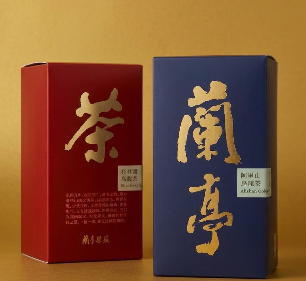
北極設計以既有品牌資產為基礎,重新整合品牌視覺元素。中秋禮盒以「蘭亭」為設計概念,將傳統亭閣轉化為細緻的燙金線條;茶葉包裝結合《蘭亭集序》的文化意象與書法字體;提袋則放大原有書法字樣,強化品牌識別與視覺一致性。
本次設計透過品牌識別的重新梳理與包裝視覺整合,保留蘭亭茶莊原有的文化特色,同時建立符合當代市場需求的茶葉禮盒形象。
本作品亦於2026桃園設計展展出。
Lanting Tea House is a well-established tea brand based in Taoyuan, Taiwan, with a rich cultural heritage and a distinctive brand identity featuring calligraphy by a renowned calligrapher.
Building on the brand’s existing assets, North Pole Design refined and integrated its visual identity. The Mid-Autumn Festival gift box draws inspiration from the concept of “Lanting,” translating traditional pavilion architecture into delicate gold-foil linework. The tea packaging incorporates cultural references to The Orchid Pavilion Preface (Lanting Xu) alongside traditional calligraphy, while the shopping bag prominently features the original calligraphic lettering to strengthen brand recognition and visual consistency.
Through the refinement of brand identity and the integration of packaging design, the project preserves Lanting Tea House’s cultural heritage while establishing a contemporary visual identity suited to today's market.
The project was also featured at the 2026 Taoyuan Design Expo.